


ggtaichi is a ggplot2 extension that
compares data from two sources on a single grid of taichi (yin-yang)
diagrams. A regular heat map made with geom_tile() encodes
three dimensions (the x, y position and one
value); geom_taichi() turns every cell into a taichi symbol
whose two interlocking fish are filled by two sources
at once, so four dimensions are expressed on one plot – and with the
optional data-driven eyes of v0.2.0, up to six.
Install the released version from CRAN:
install.packages("ggtaichi")Or the development version from GitHub with:
# install.packages("devtools")
devtools::install_github("PursuitOfDataScience/ggtaichi")Each symbol is a circle split by an S-curve into two interlocking fish. The yang (light) fish is shaded by one source and the yin (dark) fish by the other, each on its own gradient. By default there are no decorative dots – every drop of ink is data – and the classic eyes, when you enable them, are data channels too (see below).
library(ggtaichi)
library(ggplot2)

one <- data.frame(x = 1, y = 1, google = 7, twitter = 3)

ggplot(one, aes(x, y)) +
  geom_taichi(yin = twitter, yang = google) +
  coord_fixed() +
  theme_taichi()
The built-in pitts_tg dataset holds the 30-week
COVID-related Google and Twitter incidence rates for 9 categories in the
Pittsburgh Metropolitan Statistical Area. With many weeks the symbols
shrink, so it is often easier to read a slice. Here are the first six
weeks, where each taichi is big enough to compare the two halves at a
glance.
pitts_small <- subset(pitts_tg, week <= 6)

ggplot(pitts_small, aes(x = week, y = category)) +
  geom_taichi(yin = Twitter, yang = Google) +
  theme_taichi() +
  ggtitle("Pittsburgh: Google (yang) vs Twitter (yin), weeks 1-6")
The legend titles default to the column names you supply. Note how
Covid and Masks lean dark (high Twitter) while
staying pink (moderate Google).
Each fish gets its own gradient, and any extra argument is passed
straight to ggplot2::scale_fill_gradientn().
ggplot(pitts_small, aes(x = week, y = category)) +
  geom_taichi(
    yin  = Twitter, yin_name  = "Twitter (%)",
    yin_colors  = c("#deebf7", "#3182bd", "#08306b"),
    yang = Google,  yang_name = "Google (%)",
    yang_colors = c("#fee6ce", "#e6550d", "#7f2704")
  ) +
  theme_taichi()
Because geom_taichi() is an ordinary layer, faceting
just works. The states_tg dataset repeats the same
measurements across four states; showing two of them over a handful of
weeks keeps the glyphs large and legible.
two_states <- subset(states_tg, state %in% c("New York", "Texas") & week <= 6)

ggplot(two_states, aes(x = week, y = category)) +
  geom_taichi(yin = Twitter, yang = Google) +
  facet_wrap(~ state, ncol = 1) +
  remove_padding(x = "c", y = "d") +
  theme_taichi() +
  ggtitle("New York vs Texas, weeks 1-6")
eyes = TRUE draws the classic taichi dots, each centred
in its own fish’s head. The eye arguments accept a constant or a
data column: mapped eye sizes (rescaled to sensible radii) and
colours make the glyph a genuine six-dimensional mark –
x, y, two fills, two eyes.
quad <- data.frame(
  x = c(1, 2, 1, 2),
  y = c(2, 2, 1, 1),
  yin = c(3, 5, 7, 9),
  yang = c(9, 7, 5, 3),
  reach = c(10, 40, 25, 5),
  quality = c(2, 1, 4, 8)
)

ggplot(quad, aes(x, y)) +
  geom_taichi(yin = yin, yang = yang,
              eyes = TRUE,
              yin_eye_size = reach,
              yang_eye_size = quality,
              limits = c(0, 10)) +  # shared limits keep the palest fish visible
  coord_fixed() +
  theme_taichi() +
  ggtitle("Eye sizes encode a 5th and 6th variable")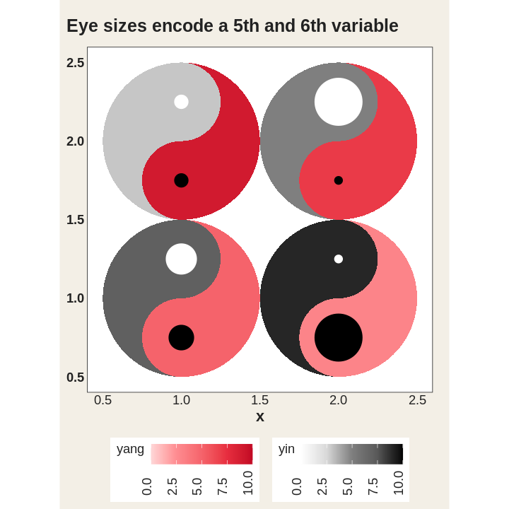
angle rotates each glyph by a constant or by a column,
so orientation can encode a directional or temporal variable – and,
combined with gganimate, produces
the iconic spinning taichi (see
vignette("animations")).
rot <- data.frame(x = 1:4, y = 1, yin = 1:4, yang = 4:1,
                  turn = c(0, 45, 90, 135))

ggplot(rot, aes(x, y)) +
  geom_taichi(yin = yin, yang = yang, angle = turn, eyes = TRUE,
              limits = c(0, 5)) +
  coord_fixed() +
  theme_taichi()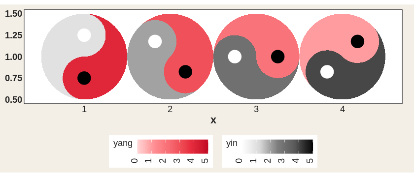
Factor, character, and logical columns now get a discrete fill scale
automatically (v0.1.0 could only draw continuous values); computed
expressions like factor(week) work too, and
yin_scale / yang_scale accept any custom fill
scale.
disc <- data.frame(
  x = c(1, 2, 1, 2),
  y = c(2, 2, 1, 1),
  method = factor(c("A", "B", "C", "A")),
  outcome = factor(c("win", "loss", "win", "loss"))
)

ggplot(disc, aes(x, y)) +
  geom_taichi(yin = method, yang = outcome) +
  coord_fixed() +
  theme_taichi() +
  ggtitle("Discrete yin & yang")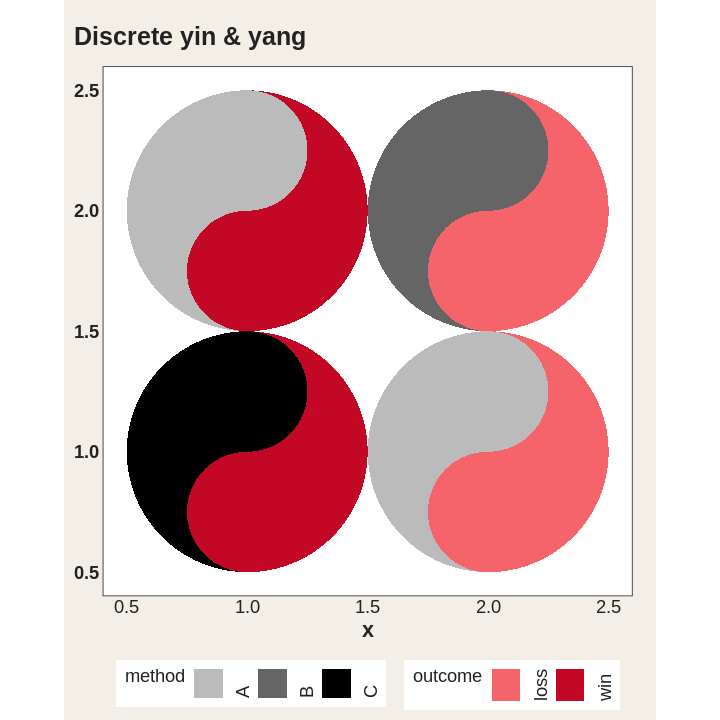
v0.2.0 also fixes the parameter routing of
geom_taichi(): alpha, colour,
linewidth, linetype, width,
height, na.rm, and show.legend
are all real arguments now, the deprecated size maps to
linewidth with a warning, missing or misspelled
yin / yang columns error immediately with a
clear message, and the geometry is guarded by a testthat + vdiffr
suite.
When both sources share units, shared_legend = TRUE puts
them on a single scale and a single legend
(shared_limits = TRUE aligns limits while keeping separate
palettes). The bundled synthetic cafes_tg data – espresso
vs matcha orders across eight neighbourhoods – is made for it:
ggplot(cafes_tg, aes(x = week, y = neighbourhood)) +
  geom_taichi(yin = matcha, yang = espresso,
              shared_legend = TRUE,
              yin_name = "orders / 100 customers") +
  remove_padding() +
  theme_taichi() +
  ggtitle("Espresso (yang) vs matcha (yin)")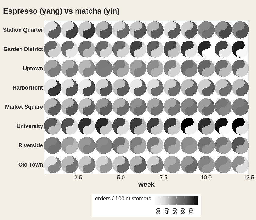
v0.2.0 also exports the building blocks geom_yin_fish()
/ geom_yang_fish() for fully manual scale control, lets
remove_padding() auto-detect the axis types (no more
"c" / "d" guessing), and draws each layer as
one batched polygon – a 1200-cell grid renders about 15x faster than
with the per-cell grob building of v0.1.0, pixel-for-pixel
identically.
The taichi is a cyclical symbol, so motion suits it:
geom_taichi() composes cleanly with gganimate
– turn a third variable into animation frames instead of an axis, or
spin the glyphs via angle. Full recipes live in
vignette("animations").
See vignette("ggtaichi") for the full tour, and the gallery
for more looks.
ggtaichi is built on top of, and is the spiritual
sibling of, the ggDoubleHeat
package, which introduced the idea of folding two data sources into a
single reformed heat map through the geom_heat_*() family.
ggtaichi reuses that two-scale design (and its example
data) and re-imagines the per-cell glyph as a taichi diagram.
ggDoubleHeat is the foundational layer of this package and
should be cited when you use ggtaichi:
Yu Y, Buskirk T (2025). ggDoubleHeat: A Heatmap-Like Visualization Tool. R package version 0.1.3. CRAN: https://CRAN.R-project.org/package=ggDoubleHeat, GitHub: https://github.com/PursuitOfDataScience/ggDoubleHeat
@Manual{,
  title  = {ggDoubleHeat: A Heatmap-Like Visualization Tool},
  author = {Youzhi Yu and Trent Buskirk},
  year   = {2025},
  note   = {R package version 0.1.3.
            GitHub: https://github.com/PursuitOfDataScience/ggDoubleHeat},
  url    = {https://CRAN.R-project.org/package=ggDoubleHeat},
}